
ASURION
AT&T SimpleSetup enables in-store sales representatives to focus on selling.
Overview
Asurion, a third-party insurance provider, white labels its services to AT&T, Verizon, Sprint, and T-Mobile. Providing coverage to their customers for damaged devices as well as anytime technical support.
AT&T SimpleSetup, later expanding to the Asurion Sales Portal, was created from a design sprint as a way to solve a pain point that occurred after a phone was sold. In-store sales reps often sat with customers for hours educating them on how to use their device, transfer contacts, install apps, etc. Our goal was to grow the product to be the single point of contact between carriers and Asurion. So when a customer needed support, a sales rep could easily connect them with an authorized technician.
This allowed sales reps to focus on selling, Asurion to have direct contact with customers, and enabled customers to resolve issues from the comfort of their homes. A win-win-win.
My Role
Since there were only two of us from design, it was each of our responsibility to understand the users and take ownership of the design cycle from end to end. We shared responsibilities for all research and design efforts and worked together collaboratively. However, we also had our strengths and would take the lead when applicable.
I have only showcased my contributions, which are focused on scaling, enablement, and engagement.
Company
Asurion
Clients
AT&T
Verizon
Sprint
T-Mobile
Team
2 Designers
9 Engineers
1 Product Manager
CHALLENGES
When I joined, SimpleSetup was coming out of a design sprint and already showed signs of success in the pilot market. Still, there were a few problems that needed to be addressed:
01.
The AT&T test market wasn’t providing enough quantitative or qualitative insights.
02.
Sales reps were still spending hours post-sale on setting up a customer's new device.
03.
Sales reps didn't fully grasp the value and would revert to previous methods.
OBJECTIVES
Based on these challenges, we established several goals to target:
01.
Increase the number of appointments created by 15% and decrease the time to schedule by 10%.
02.
Increase dashboard views by 50% and content library views by 20%.
03.
Understand all user types involved by researching other carriers in other cities, Asurion support agents, and mobile customers.
RESEARCH
My design partner and I would conduct store visits every other week for discovery. Since we were working with four different carriers there was plenty of opportunity to gather qualitative data through activities such as interviews, card sorting, and usability testing. We also had access to visit any store across the country, allowing us to work with a variety of people and use cases. In addition to the bi-weekly store visits, I also went to Asurion call centers to understand Asurion agents' needs.
Along with the qualitative data that we would collect, my team also set up and tracked quantitative data using Mixpanel, Google Analytics, and Intercom. With this data, I could highlight some common pain points in the product:
Key Findings
- Creating carrier-specific prototypes was time-consuming.
- Users were often not aware of all of the beneficial features available. They would think SimpleSetup was for new device setup only.
- Creative workarounds were done to pass off any customer to Asurion.
- Users wanted to follow up on customers because satisfaction was one of their key metrics.
- Starting an insurance claim was tedious.
- Sales reps constantly looked at their numbers and competition was a motivator.
- Educational tips were overlooked and ignored.


DESIGN SOLUTIONS
Working with the other designer, product manager, and engineering lead, we defined areas of focus.
01.
Scaling
02.
Enablement
03.
Engagement
SCALING
Redesign, Design Library, and Information Architecture
Because the product was growing out of an MVP, the team decided it was a chance to migrate to a different tech stack, React. I knew this was an opportunity to improve the site’s information architecture (IA) and also do a visual redesign. There were several items that I wanted to accomplish during this transition:
- Refresh to a cleaner visual aesthetic that was scalable and could fit each of the carrier's brand styles.
- Create a structure that allowed for expansion as we learned of other use cases.
- Ensure that the mental model was aligned with sales reps.
Brand-Specific Redesign and Design Library
I wanted to create a consistent visual experience that wouldn’t bump the users when running usability testing. Since we were getting into stores often, I needed to create prototypes faster than the existing method.
Following Atomic Design principles by Brad Frost, I created a design kit in Sketch. This molecular framework allowed us to design components that could swap between carrier brand styles and we were able to produce prototypes in just a few clicks while staying as close to a final product as possible.


SCALING
Information Architecture
To define the mental model, our team ran several activities to discover groupings, generate feature names, and find new use cases. We did this by observing quantitative data, doing open and closed card sorting, tree tests, user flows, and usability testing. We noticed:
- Site traffic showed that the path into the product wasn’t consistent and users weren’t seeing outside of the scheduler.
- Certain features needed their own section.
- Besides scheduling, tools were often grouped.
- Metrics were uniquely grouped; manager vs. rep, store vs. district, and week vs month.
- Educational content was more valued than current patterns indicated.

Dendrogram showing results of the card sorting

User Flow of SimpleSetup
By restructuring the layout, I was able to prepare for new use cases and future proof. Some key changes I did include:
- Moving top navigation to side navigation, allowing space for upcoming features, and making the Schedule Appointment CTA more prominent.
- Giving the training its own section to expand functionality, such as filters and tracking.
- Improved dashboard analytics, defaulting to monthly and individual because those were the most clicked.


Before and After Slider of Dashboard
Outcome
Creating a design library allowed us to put together prototypes for usability testing or stakeholder presentations much faster. We ramped up testing from once a month to twice a month. The card sorting activity also lent some key insights/use cases around competition and gamification.
By making IA changes and adjusting where the users navigated in from, dashboard views increased by over 10x, which was a huge success over the original goal of 50%.
ENABLEMENT
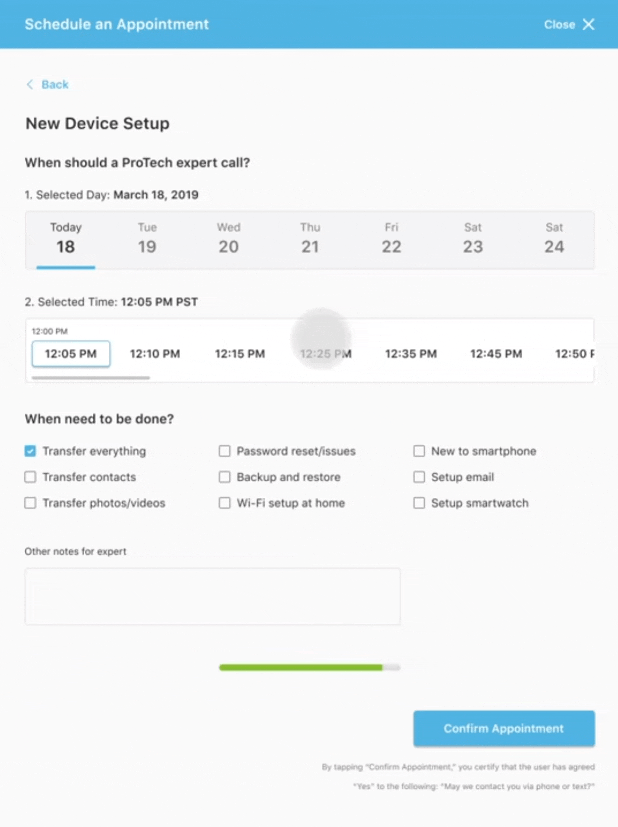
Appointment Scheduling
As reps grew to use SimpleSetup, an interesting trend emerged. To save their own time, they would mask any issues that they didn't want to deal with as “new device set up” and offload the problem to Asurion agents. It was estimated that around 1/3 of the appointments created were not for "new device setup".
While I was on a research visit to the Asurion Phoenix call center, agents confirmed this workaround happened but was probably higher at 40-50% of tickets. Because the app wasn't designed to capture information outside of "new device setup", what was passed along to an agent was never accurate. The agent would spend up to 15 minutes trying to understand the problem and collect the correct information. The increased time greatly affected their metrics, which were based on time spent on a single call.
Appointment "Experiences"
My team decided to categorize the various reasons customers called Asurion and sort them into “Experiences”.
Using these Experiences, we restructured the appointment creation flow. So when a rep went to set up they could select the type of issue the customer was facing and provide specific data to that Experience, thus front-loading the information and increasing support call efficiency.


Scheduler Iterations Over Time

Final Flow
Date / Time Selection
Through usability testing, I saw that selecting the date and time in a standard drop-down component added points of frustration. I knew this was where I should focus on improvement to reach our goal of reducing time to schedule by 10%.
From quantitative data in Mixpanel, we saw that kept appointments occurred when they were scheduled within five days. Kept appointments were a key metric used to track customer happiness, so I knew forcing the appointment date selection to be within one week would help this metric.
I also saw that when users were looking for a certain time, they often scrolled a long list of time slots. To improve this I added buttons that would move the view area to a certain time of the day, I chose to hide unavailable time slots, and I added moving labels to show what hour they were in. All of these changes made selecting much faster.
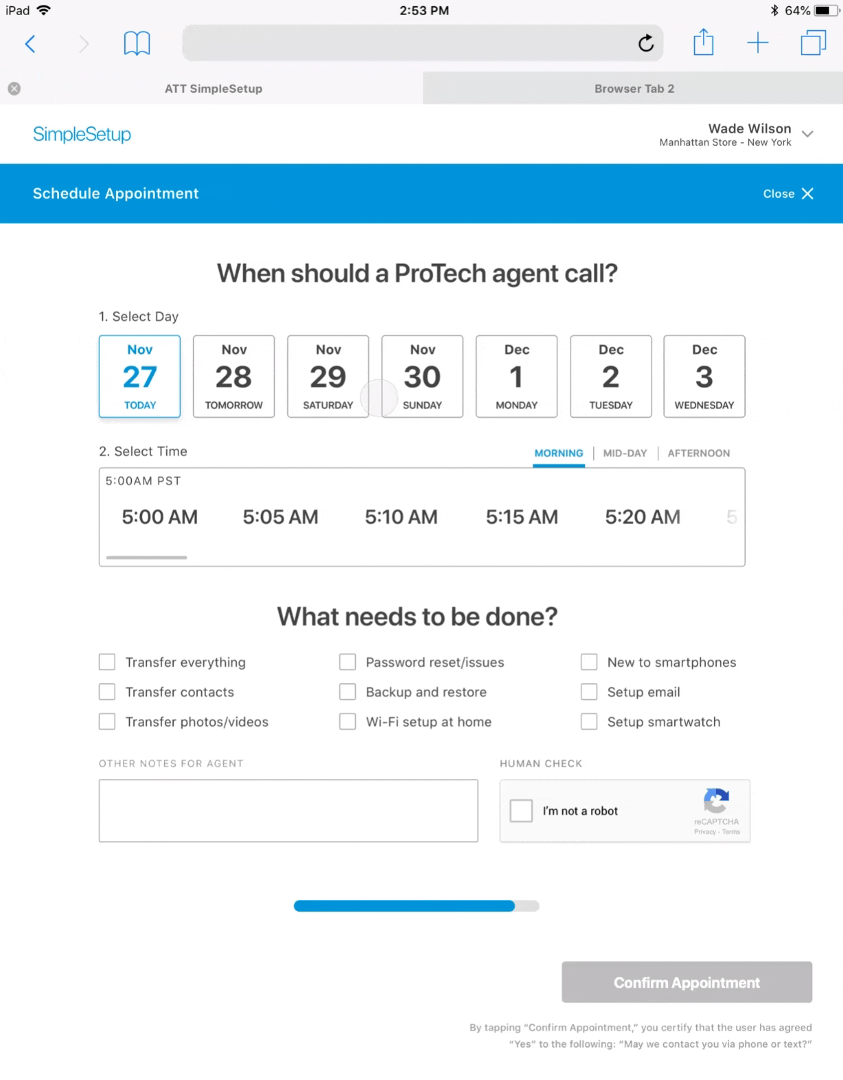
Date/Time Selection Improvements
Confirmation Message
Another improvement was around the confirmation message after creating a successful appointment. A full-screen modal would be shown that confirmed appointment details and the next steps. However, I saw that users typically closed the app on this screen, thus creating a drop-off and greatly affecting discoverability.
Instead, I designed a dismissible message that appeared on the top of the dashboard. This allowed the message to be shown but didn't place them in a dead-end flow. I used Lottie and After Effects to design the JSON animation and gave it to developers.

Before
After
Outcome
These improvements led to an 18% decrease in time to schedule an appointment, 8% more than our original goal of 10%.
Appointment History
I knew that reps wanted a way to see if scheduled appointments were kept. They couldn't track customer happiness and in a contract-less world, carriers needed low churn to ensure the customer wouldn’t switch to another carrier.
My solution was to close the feedback loop and provide transparency through a transaction history. This log showed customer appointment details, notes for the agent, and if appointments were kept or missed. The visibility allowed reps to follow up when necessary, which was important because of their WTR (a metric for customer satisfaction and compensation.).
Appointment History
Outcome
This was well received by our users, but not tracked quantitatively. However, it did spark conceptual ideas such as rescheduling and customer overview.
Claims Tool
The most common support issue was around damaged devices. When a customer walked into a store with a broken phone they typically expected it to be fixed or swapped out on site. However, that wasn't how the insurance worked with carriers. Instead, a customer was forced to call and start a claim through Asurion, a very unsatisfying and antiquated response.
“When customers come in to file claims, it's time-consuming for us. Customers also hate getting back on the phone to set up a claim and waiting to be connected to an agent."
– AT&T REP IN SLC
A straightforward solution was the claims tool. A sales rep could enter the customer's information and the customer would get a link to start the process. This streamlined the process and avoided phone calls.

Claims Tool
Outcome
Unfortunately, we were constrained by the need for the customer to fill out the information themselves in-store due to potential fraud. This solution got the ball rolling and the customer could see the rep was doing all that they could to help. It was a quick and simple win that ended up being instrumental in setting the foundation for improving the entire claims process.
ENGAGEMENT
Leaderboard and Metrics
The metrics displayed on the dashboard were one of the most liked features, but common feedback was, “I want to know how I am doing compared to others".
This made sense because a good sales rep is naturally competitive. The drive to compete and compare themselves was something innate. Their role was commission based, so a real-time look at their numbers and their ranking against colleagues was important. Whether it was between reps in the same store, area, district, or nationwide, they wanted to know how their work compared to other reps.
“We have a lot of trash talkers… if reps could go in and see how
they were performing vs. other reps it’d be great.”
– Wilmer, Chicago AT&T Store Manager
This style of gamification was similar to other products they were used to, like the Samsung PRO app, a rewards app that tested their knowledge of Samsung products.
On top of that, managers would have their stores compete against other stores. Winners received free lunches or “swag” (branded shirts or accessories) if they outperformed.
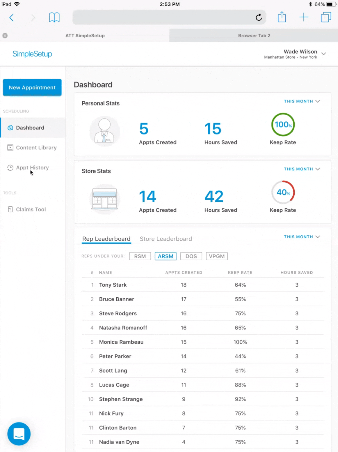
I knew that the dashboard needed more useful metrics to drive engagement. I researched what numbers meant the most to both the reps and managers.

After a few months of testing and many iterations, the designs evolved from showing granular graphs to pulling back and highlighting only the most valuable information to the user logged in. Such as:
- 2-tabbed leaderboard, personal, and store stats
- A user specific default stat view
- Managers saw store stats in a high-level monthly view and reps saw individual stats in a granular weekly view
- Comparison of current metrics vs a previous time frame
- Quick view of their rank with a motivational message
- A leaderboard highlighting the top 10 reps with the ability to filter


Dashboard Iterations Over Time
Outcome
Following up on the redesign we noticed an increase of 22% in appointments created, which was slightly higher than the 15% goal.
Another interesting outcome was even when we talked to reps who didn't have much knowledge of SimpleSetup, they always knew their metrics or rankings.
Sales Training
The educational quick tips were appreciated by reps, but this section was sometimes missed. It provided resources such as articles and videos on how to use SimpleSetup and sales techniques to become better sellers. Those who attested to loving it would spend their downtime catching up, but we heard criticism that there was no way to track which trainings were in progress or completed. So our goal was to increase usage of the training and get them to consume all content.

Before
I decided that to drive engagement, there needed to be a form of gamification involved. My solution was to provide a completion card on the dashboard to encourage a 100% completion status. To make the section more robust and add features we moved all educational content to its own tab called sales training. Within the new tab, we added functionality with filtering, sorting, and completion status.


New Sales Training
Outcome
This feature still had plenty of opportunity to grow, but as an MVP it met the requirements of driving more engagement; roughly a 42% increase in the number of content items viewed per session. Managers also loved the completion tracking because they would set quarterly goals around maintaining 100%.
FINAL OUTCOMES
In 9 months, my team and I scaled a simple tool into a successful and impactful product that did more than just create appointments for a new device setup. We took an MVP and transformed it into something that would eventually be used by three other carriers; increasing annual revenue.
We highlighted many pain points and discovered new use cases and I believe that because of our work, Asurion was able to expand its business by acquiring uBreakiFix.
Unfortunately due to finances, Asurion had to eliminate many of the call center agents later that year. This changed the purpose of SimpleSetup tremendously and the company pivoted more into a digital self-guided solution.
NEXT STEPS
There was a lot of conceptual work that was designed but never implemented.
Search and Repair
When a customer broke the screen on their device, options were limited. A new concept was being worked on where Asurion would outsource small repairs to 3rd party vendors (e.g. uBreakiFix). A sales rep would be able to find a local repair shop and select an appointment time for the customer. I believe that this eventually led to the acquisition of uBreakiFix. (This prototype was made in Principle)

Customer Profile
An idea that came from appointment history was customer profiles. A more in-depth look at the customer's history, interests, upcoming appointments, their device, and most importantly upgrade (selling) opportunities.


©2023 ALL RIGHTS RESERVED